
Choosing colors is one of the most exciting parts of watercolor painting, but with so many options, it can also feel a little overwhelming. A great place to start is by choosing one dominant color and building the rest of your palette around it.
Whether you’re painting loose florals, a coastal landscape, or a detailed seascape, being intentional with your color choices will help keep your painting vibrant, balanced, and free from muddy mixes.
1. Start With a Dominant Color
Before you begin painting, think about the overall mood you want to create and which color will play the biggest role in your piece. This becomes your dominant color, while the other colors in your palette should support and complement it rather than compete for attention.
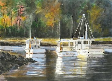
If you look through my paintings, you’ll notice that blue is often my dominant color. Living and painting in Maine, I’m constantly inspired by the blues found in the ocean, sky, lakes, and coastline.
2. Try a Split Primary Palette
A split primary palette is a wonderful way to create a wide range of colors without needing dozens of different paints. Instead of using just one red, yellow, and blue, choose both a warm and cool version of each primary color.
Warm primaries lean toward the neighboring warm hues on the color wheel. For example, a warm red will have more of a yellow undertone.
Cool primaries lean in the opposite direction. A cool red, for example, will have more of a blue undertone.
Having both warm and cool versions of your primary colors gives you more control when mixing and makes it easier to create clean, vibrant secondary colors.
3. Balance Contrast and Saturation
Bright, saturated colors can bring energy to a painting, but not every area needs to compete for attention. Using a combination of bold and more subdued colors helps guide the viewer’s eye toward the most important parts of your composition.
Value is just as important as color. The difference between your lightest lights and darkest darks can have an even greater impact on making your subject stand out.
Keep your color wheel nearby, experiment with different combinations, and don’t be afraid to make a few test swatches before committing to your final palette. Part of the fun of watercolor is discovering how colors interact once they meet on the paper.